Darktable editing workflow: scene-referred update
Over five years after I did my initial post on working with Darktable, much of Darktable’s processing has changed, notably by switching into a scene-referred workflow, which has deprecated many of the modules I used to use. I’ve adapted and improved my workflow with the new processing pipeline, and it has worked much better than it used to with the display-referred workflow.
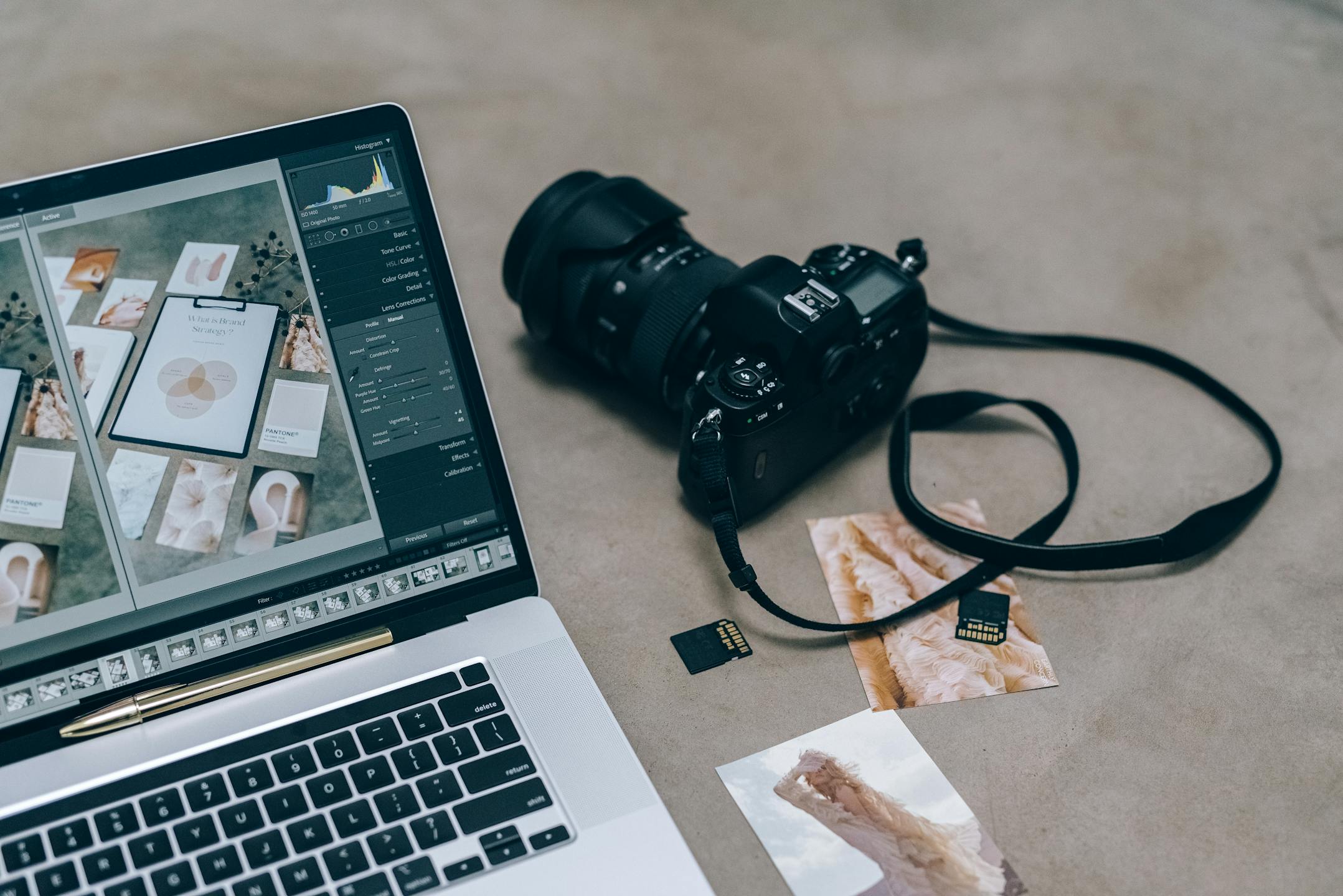
I won’t go into much detail about this whole scene-referred vs. display-referred pipeline, but if you’re interested, Darktable has a good, short blog post on this topic. In this post, I’ll go through my workflow in Darktable and how I edit and export my pictures. As before, I won’t cover organizing my photo collection or other features besides culling, editing and exporting. I covered importing in my previous post, so if you’re interested, there it is. I’ll skip it for the sake of avoiding repetition as I still do the exact same thing.
For this post, I’ll follow the same idea as before, taking an image I edited using most of the steps outlined below and include screenshots of the process as I go along the editing workflow. This was written using Darktable 5.2.1.
Culling and sorting images
Rejecting unusable images
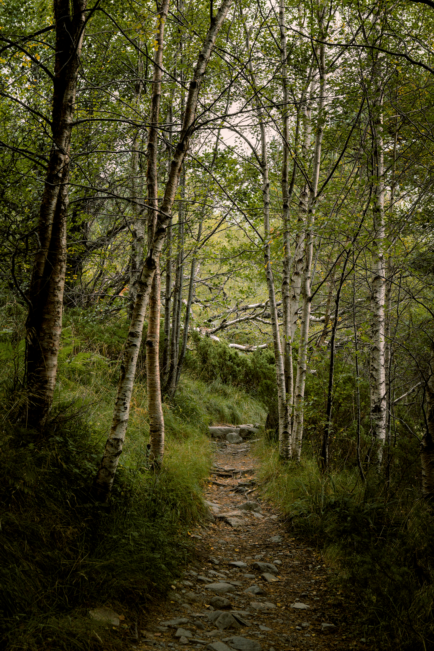
Once I import all of my images into Darktable, I’ll work out of the collection I just created to quickly cull images that are simply unusable. Anything that’s out of focus, too underexposed or overexposed, useless framings, misclicks, etc. This is my first focus check, but it’s meant to be super quick so it’s expected I will miss slightly soft images which may be only just out of focus or focused on the wrong subject.
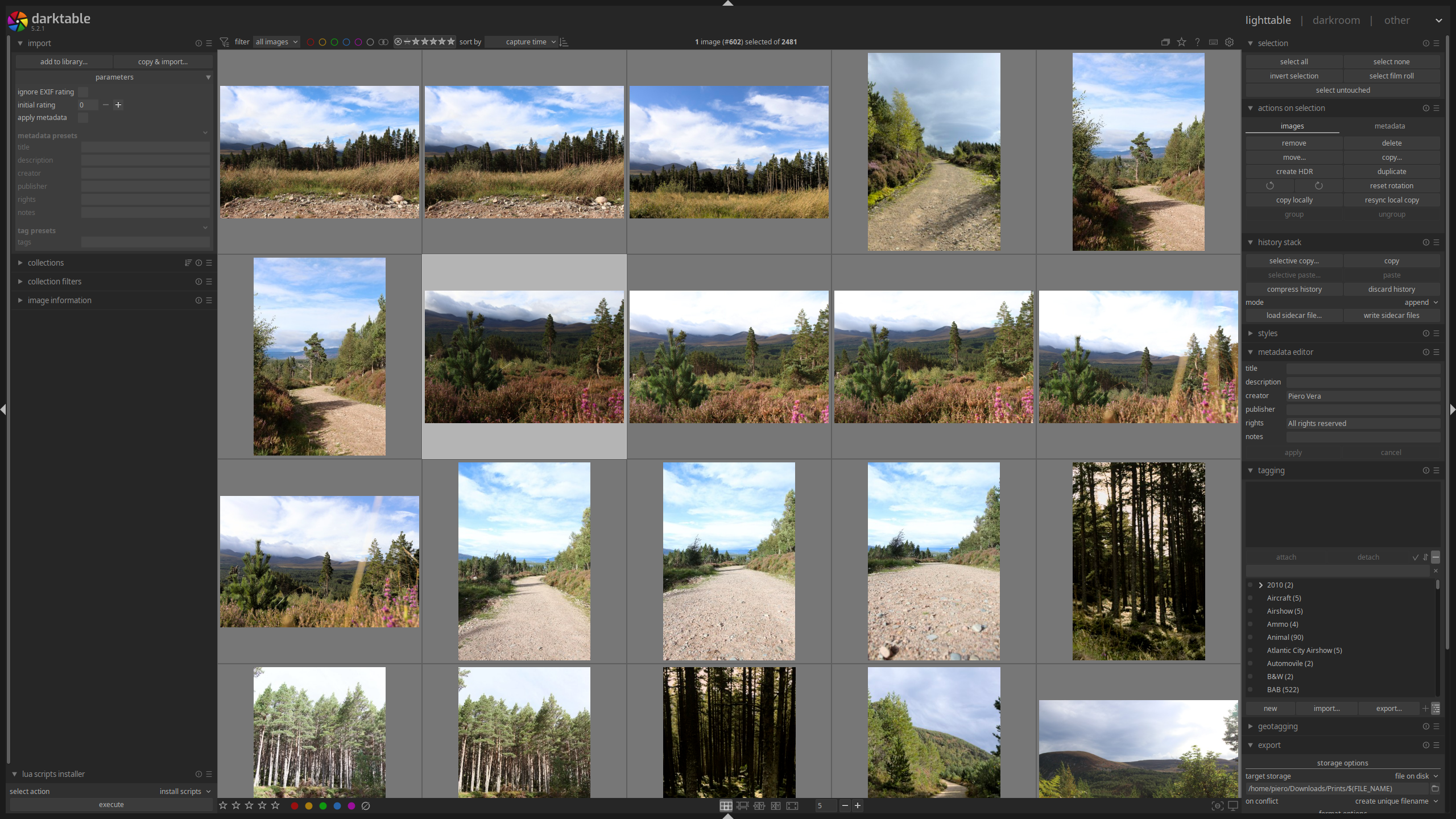
Darktable lighttable view after import
For this, I will go into culling mode from the lighttable view by hitting x. I’ll pass
through the images quickly, zooming in using Ctrl+mouse wheel to check for
sharpness. I probably spend no more than a second per image, as I don’t care about
composition just yet, only sharpness. This is still one of the longest passes as I have to
go through all images, so if it’s a large collection, it might still take multiple hours
(plus it’s exhausting). Images gone from this batch are rejected by hitting r. These are
images I could safely delete without losing anything. You can go back and forth with the
arrow keys or scroll wheel.
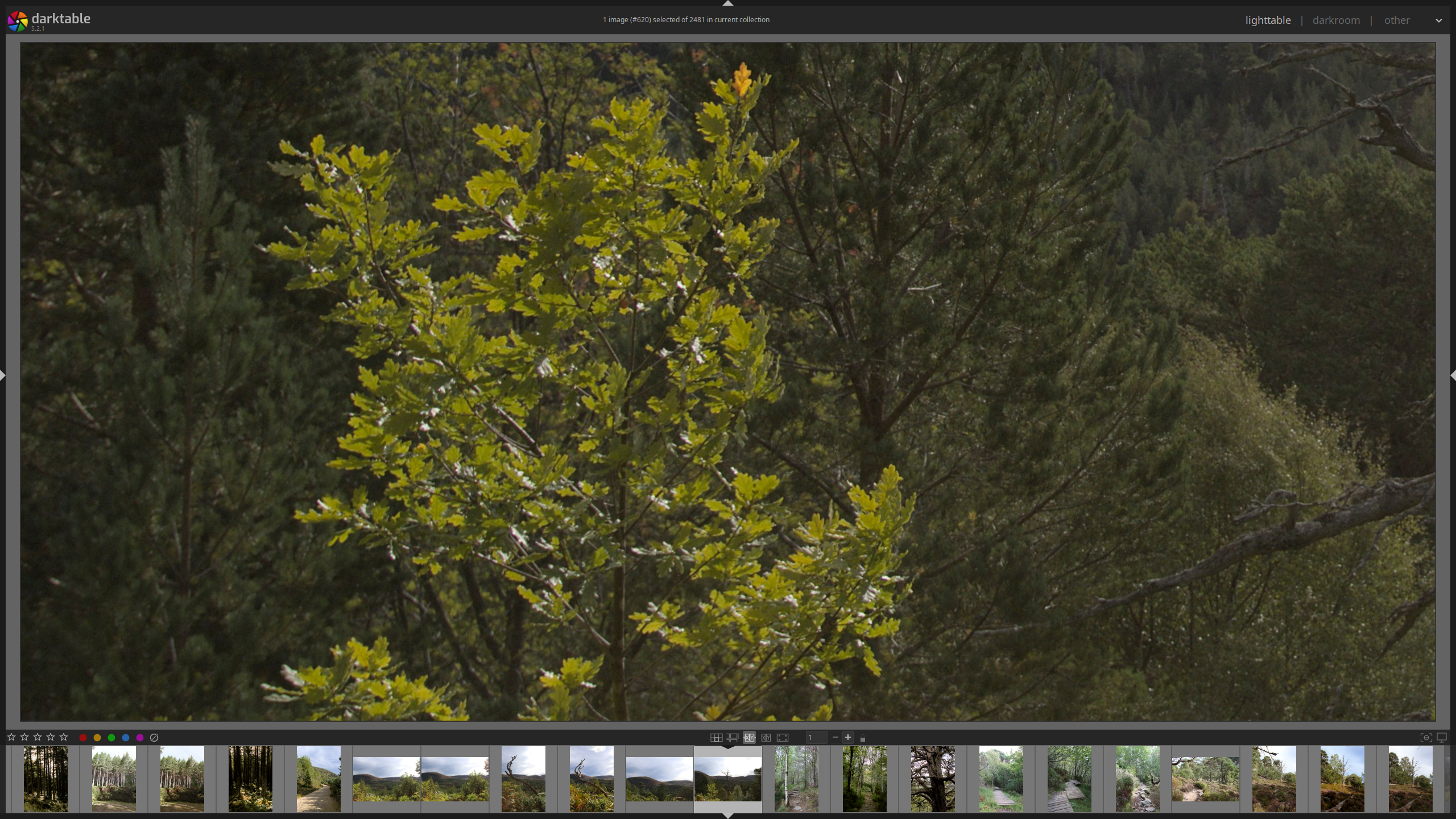
Darktable culling while zoomed in to check for focus
Initial image selection
After rejecting unusable images, which are usually only a few unless shooting conditions
were very bad, I go through again without zooming in, looking at general composition,
lighting, subjects and color (though not as much). In this stage, I’m trying to find any
images that have anything interesting going on. It’s still a very quick pass, spending one
to two seconds max per image. Images that may be duplicated will be kept here; I’m just
collecting anything that’s even somewhat worth thinking about. I’ll mark these images one
star by hitting 1 as I pass them. I will end up getting rid of about 15-30% of all
images here. Something I don’t do anymore is view multiple images in the culling view at
once. I don’t do this for two reasons: I want to see the image as large as possible, and
scoring them is a lot quicker when you don’t have to worry about selecting the right one
from all the ones you’re seeing.
First editing batch
The next stages are where I’ll start the editing process. I’ll go through all the one-star
images and more carefully select those I do want to edit. For duplicate sets, I’ll try to
select the best one, but if there are two similar ones that I both like, I’ll just tag
both with two stars and move on with it. I don’t think about it too deeply, but I will
look more carefully at each image and select those I consider to be at least decent. I’ll
mark them two stars by hitting 2. Once done, I should have about 20% or less of the
images I started with. This is by far the longest stage, as I start lightly editing the
images to see what they would look like once processed, as well as finding possible issues
such as clipped highlights or lost detail, which will help me during the next culling
stage.
Final selections
Once I’m done lightly editing everything, I will go through another harsh culling
round. Here, I might end up getting rid of almost all images left, leaving me again with
20% or less of the 2-star images. I’ll mark these 3 stars and for this I will nitpick and
stare at them long enough to decide which ones I really want to select. Same as before, I
hit 3 to mark them as 3 stars in the cullling view.
This is culling essentially done. I will edit those images thoroughly and will come back multiple times to make sure that’s how I want them to look, or adjust accordingly. I will experiment here to figure out if I want to take the image in a different direction. This stage is iterative, and takes very long per image, where I might even go back to the two-star collection and “promote” images to 3 stars, and vice-versa, knock images which didn’t look good after editing to 2 stars. Once they’re fully edited, anything I really like is going into 4 stars. This is what I usually end up sharing (or nowadays, printing). 5 stars is anything I truly love. And that’s it for selecting and ranking images. On to editing.
Editing
Basics
This is where my editing workflow has changed significantly compared to my post in 2020. The UI is still very similar, so to begin editing, you double-click on the image you want to edit, which will open the darkroom view. Before I do this, however, I take a good look at the camera preview JPEG which is what Darktable will show in the lighttable view until you make an edit. This is because I want to use that JPEG as my reference point and for most images, the initial, light editing will mostly try to achieve a similar result.
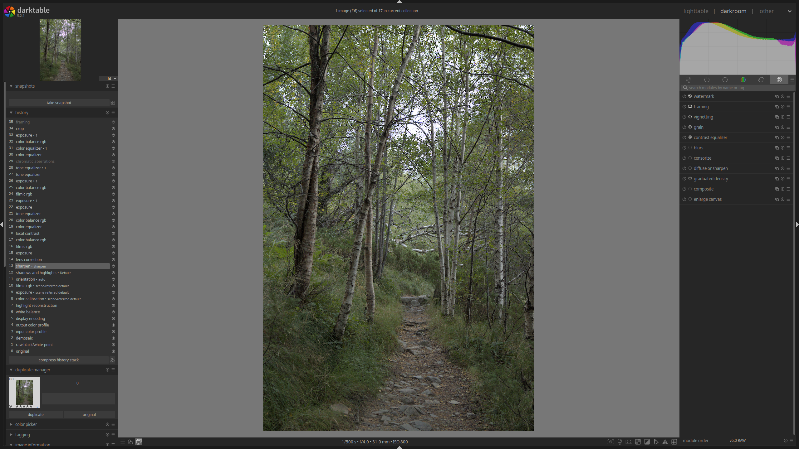
Darkroom view with base changes applied and no edits
Corrections
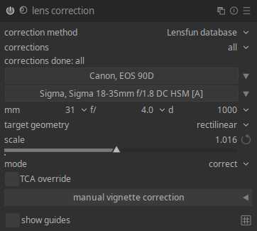
Lens correction module. Note the camera, lens and corrections are automatically applied.
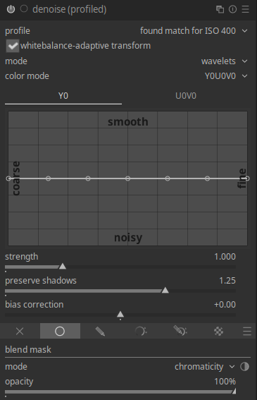
Profiled denoise module with a chromaticity mask applied.
The very first thing I do with every single image is to go to the “correct” module tab and enable lens correction. For most lenses, this should mean lens corrections get applied automatically; you don’t need to do much else. This is the case for me, so I don’t have any manual lens correction workflow. I no longer change the demosaic method (found under active modules) as Darktable switched the default from PPG to RCD which no longer gives me issues (you can read more about demosaic methods here). I don’t have issues with hot pixels on my new camera, so I don’t use the demosaic color smoothing either, but it’s still a good feature to keep in mind.
Depending on the image, I might also apply denoising within the “correct” tab. I still don’t mind grain, so I will apply profiled denoising with a chromaticity mask. This way I avoid losing detail while removing the annoying color shifts from digital noise. It likely doesn’t matter for most uses, especially when downscaled for the web, but I’d rather do this from the start in case I ever use the image at its maximum resolution (in printing, for instance).
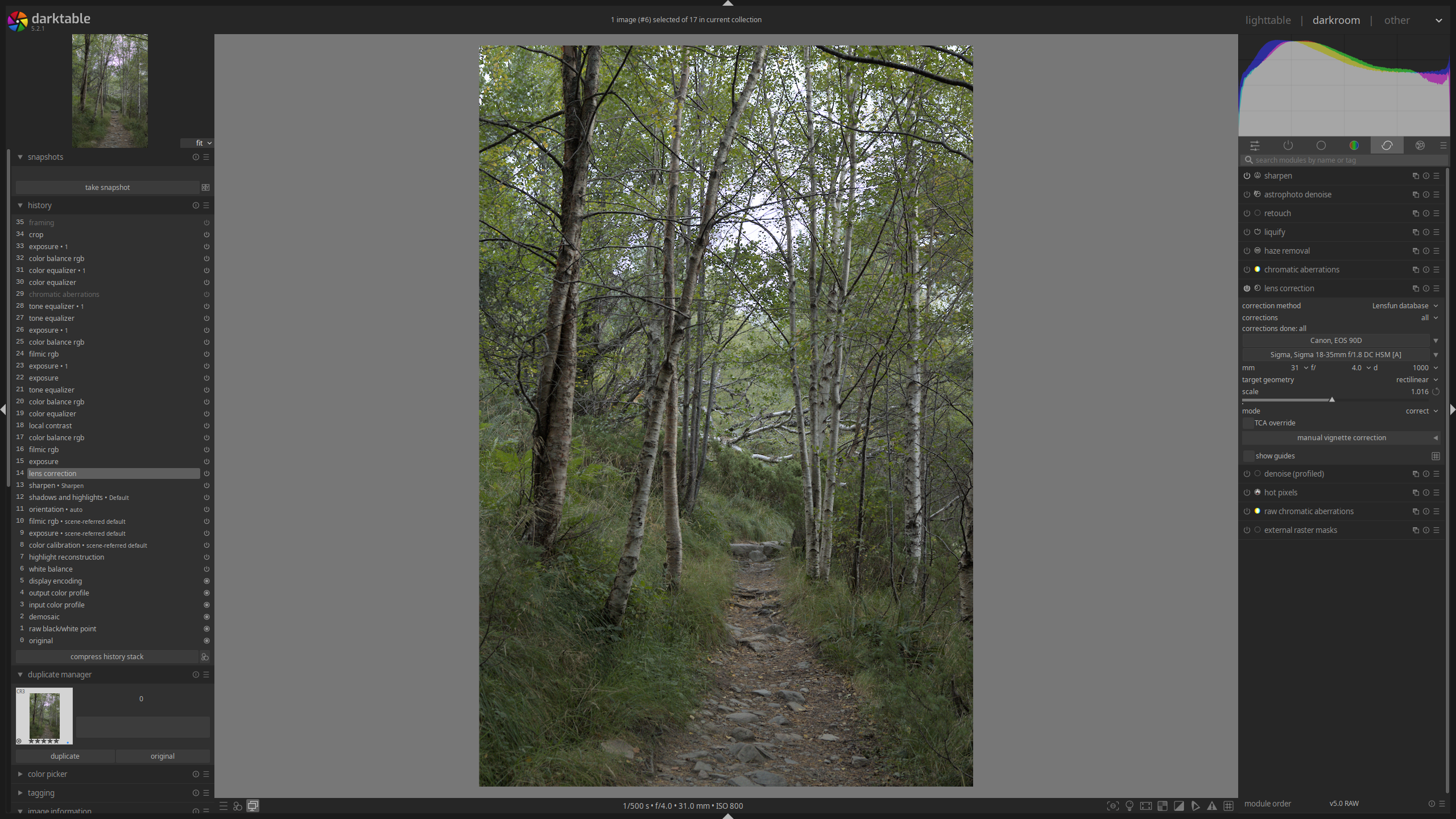
Darkroom view after applying corrections to the image
Basic exposure
For my initial, light editing, I’ll sort of follow Darktable’s scene-referred workflow, which is a good starting point on how to edit with the scene-referred processing pipeline. Under the “base” module group, I’ll set the initial image brightness using the exposure module, playing with the exposure slider until I feel the midtones are at the appropriate brightness. I don’t worry too much about the ends of the lightness spectrum, those will be adjusted later.
After this, I will go to the filmic RGB module to set the white and black points for the image in the “scene” tab. This is done by using the “white relative exposure” and “black relative exposure” sliders (I don’t really use the dynamic range scaling slider). My primary goal here will be to expand the dynamic range as much as possible without clipping anything, and once I’m there, I might either reduce it depending on how the image looks, or expand it further if the clipped details don’t matter (usually for shadows or highlights which were already blown and I’m not recovering). You can set these points automatically with the eyedropper tool, but personally I just prefer setting them manually, though if I’m not getting the results I want, I might give the automatic detection a go and see what that yields.
With this done, within the “look” tab I will set the contrast for the image with the “contrast” slider. I guide myself using the actual image as reference to figure out what I want it to look like. Once I’m happy with it, I’ll bump up the “latitude” slider as much as possible without clipping anything in the dynamic range graph above. I will usually adjust the “shadows-highlights balance” slider to get as much latitude as possible, though I recommend looking at the image to see what this is actually doing.
Depending on the image, I might also enable the local contrast module. I find this module, especially with the local Laplacian filter, tends to mess with the white and black points, so I might opt not to use it, or otherwise to switch to the bilateral grid filter. This filter has its own host of issues, and it tends to do something similar to increasing fine contrast in the contrast equalizer module (more on this module later), so often if I don’t like the results, I just disable it. However, if I really want that local contrast added, what I’ll end up doing is enabling the module, adjusting the “detail” slider, and then going back to “filmic RGB” to readjust the white and black points. This is often part of the advanced processing part, so I might leave it off during the initial pass if it’s problematic.
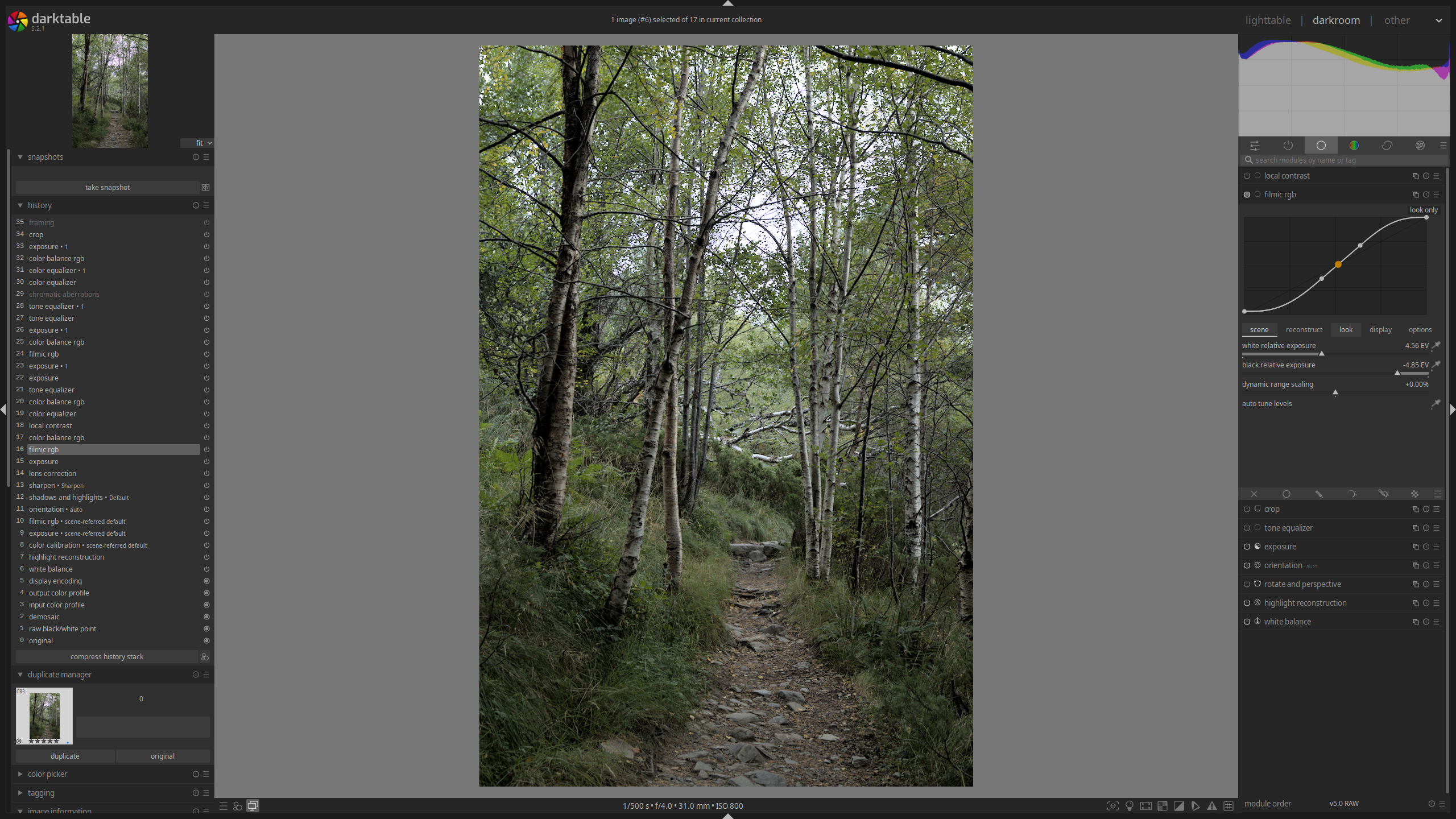
Image after basic exposure corrections have been applied
Color adjustments
To adjust my colors, I will go to the “color” module group and using the color balance rgb module, raise the “global vibrance” as high as it looks good, as well as the “global saturation slider” module for some images that may need additional saturation. Once my colors are more saturated, I’ll finally go back to set my white balance. The reason I do it this way is that it’s easier for my eyes to pinpoint the right white balance once there’s enough distinction in the image’s colors.
To adjust white balance, I will use the color calibration module to set the illuminant and adjust temperature as needed with the “temperature” slider in the “CAT” tab. Sometimes Darktable decides a daylight image is lit with a Planckian illuminant, which in my experience yields poor results, so I always try to set the illuminant to “daylight” if it was in fact shot outside (which 99% of my shots are anyways). Every so often, images might have an odd tint, so I will use the “R”, “G” and “B” tabs to slightly adjust the image tint until I can achieve a neutral white point. I no longer use the white balance adjustments for creative coloration (e.g., making images warm). I use it to set my neutral colors and later tint the image as desired using the color balance RGB module (more on that later).
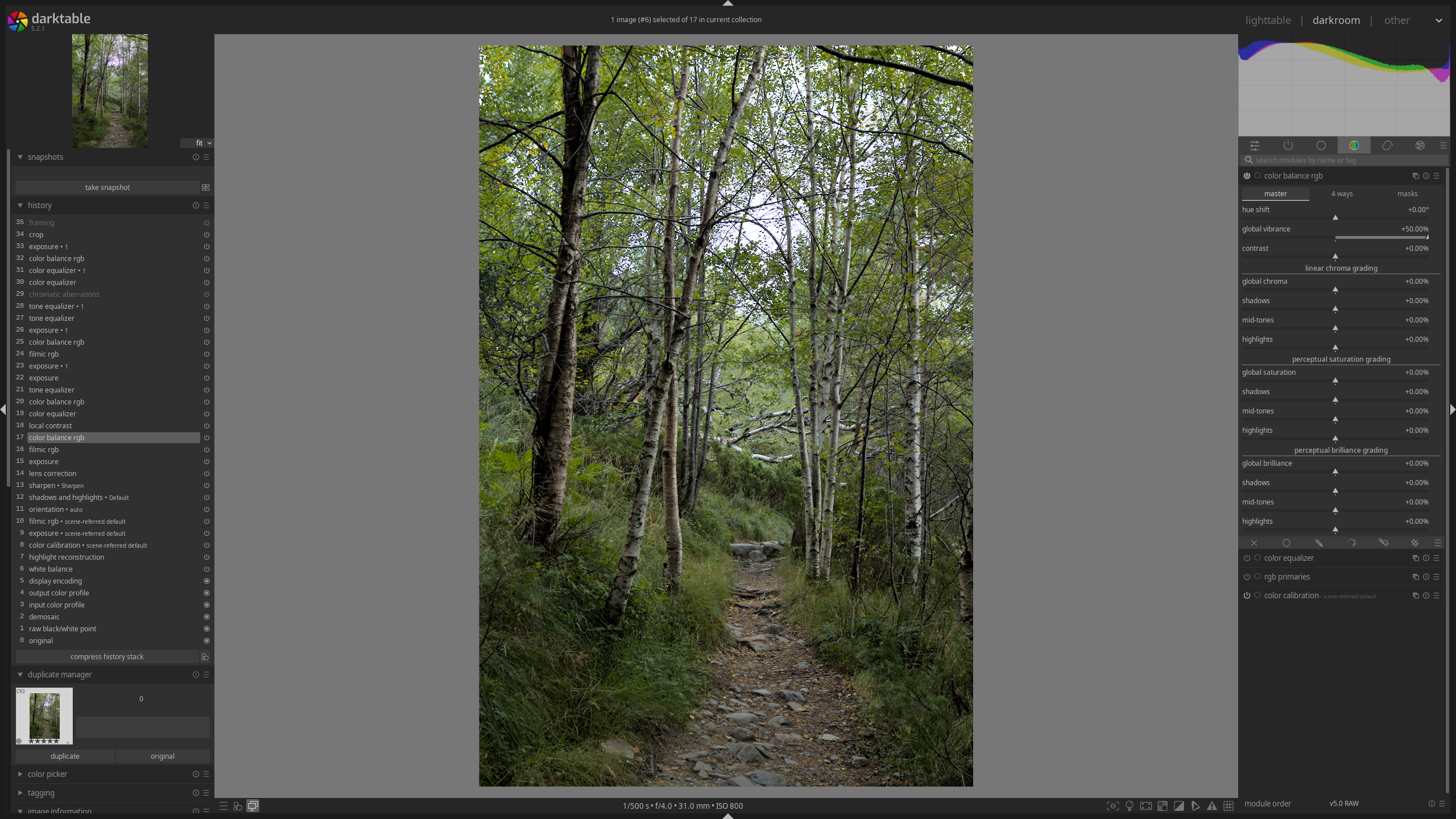
Image after basic color adjustments have been applied
This concludes my basic editing round, after which I should have something similar to the in-camera JPEG, or something different if the image wasn’t good out of camera but I decided to rescue it by taking it in a different direction.
Advanced editing
Color creativity
Staying within the “color” module tab, I may decide to further adjust colors for my image. One of the modules I will use more often is color equalizer. I will usually only use the “hue” and “saturation” tabs in this module, using the eyedropper tool and the “node placement” slider to better match the specific colors I’m targeting with my adjustments. The changes are often minor, almost subtle, by pushing a color’s saturation higher or lower to accentuate it or de-emphasize it in the image. In the “hue” tab, I might push colors to reduce the color palette, or adjust them to harmonize better with their counterparts. On some occasions, I may use it to correct a specific color: something odd I face with Darktable is that some purples and oranges in my camera are being messed up and showing up as dark browns, which has required a lot of annoying tuning with this module to get them to show up at least as they do in the in-camera JPEG preview.
Seldom, I might also use the color equalizer module to get rid of distracting colors in specific parts of the image using a drawn mask. I find desaturating/shifting them aggressively with this module yields better results than any of the other color modules, which I mostly use globally without any masks. Another uncommon but sometimes used module is the RGB primaries module. I use this one to correct some colors like the aforementioned purples and oranges, but otherwise I leave it alone as I don’t love the way it tints images.
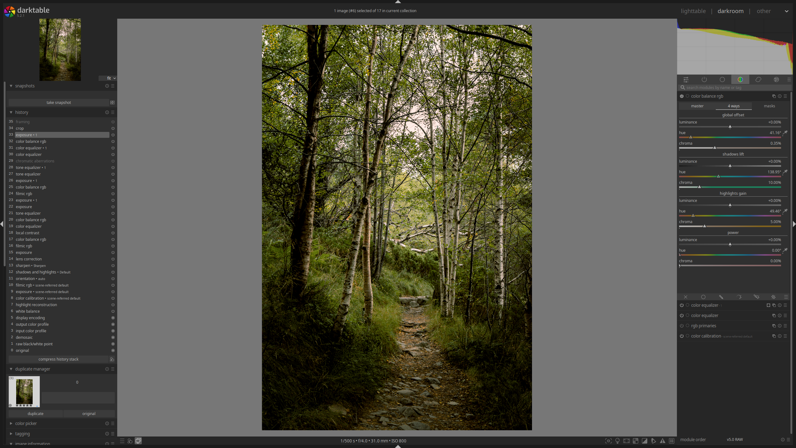
The rest of my color adjustments will come from the color balance rgb module. I may make additional adjustments in the “master” tab, mostly by adjusting either vibrance or saturation, globally for the most part. I’ll do this iteratively, as I may make adjustments after all other color changes are done. At this stage, however, I’ll be working mostly with the “4 ways” tab. This is where I will tint my image, whether globally or doing some sort of split-toning in the highlights-shadows, and every so often also using the “power” section in this tab, though I usually prefer either a global offset or a highlight-shadow split. You can play with the sliders here to find something you like, exaggerating the effect and then dialing back the “chroma” adjustment sliders. I try to use the hue angle on the color wheel to make sure I’m achieving an “ideal” color harmony, but I’m not religious about it if something looks better if modified slightly. Joanna Kustra has this incredible masterclass video on color theory and color grading in photography if you’re interested.
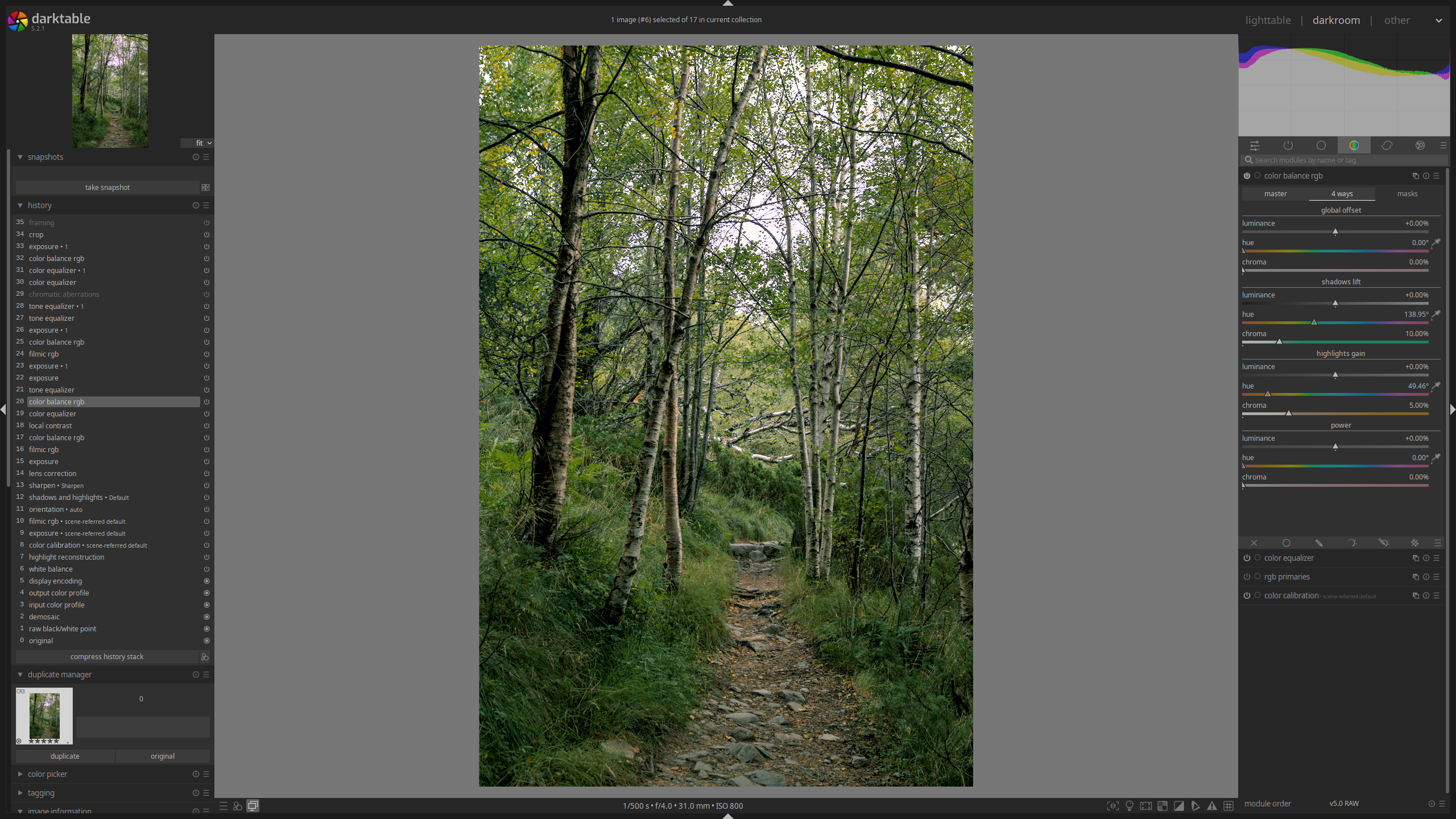
Image after applying advanced color adjustments and local contrast (covered in the next section)
For monochrome images, I will initially convert them to grayscale using the “gray” tab in the color calibration module. This is probably not the ideal or correct way to do it, but I find it works well for me, as I can prioritize certain input channels when mixing them. Do note I’m doing this after all the basic adjustments, so my exposure is already set as I’m trying to mix the RGB channels into pure lightness, which is less than ideal, and often means I’ll have to go back to adjust it, but it’s worked fine thus far. In case I decide to not stay with pure grayscale, I’ll use the color balance rgb module to tint the image, same as I do with color images.
Local Exposure Adjustments
At this stage, I might further adjust the exposure. If I didn’t use the local contrast module before, I might end up doing so here, adjusting the white-black points, contrast and latitude in the filmic rgb module as needed. Again, I prefer to stay with the local Laplacian filter, but some images are too painful to work with so I end up switching to bilateral grid or just turning the module off.
My main exposure adjustment module, especially when I want additional contrast in my image, is through the tone equalizer module under the “basic” module group. When using the module, you have a nice exposure picker, which you can hover over the image to adjust specific parts of the histogram up or down using the scroll wheel on your mouse. This is how I use the module, selecting lightness values I want to adjust and creating contrast this way (or removing it sometimes). This lets me create the right tones I’m looking for and accentuating those which I find important for the image. The final result usually ends up looking like an S-curve if you view it under the “advanced” tab in this module, which is about what I’d expect.
The other big local exposure adjustment module is simply the regular exposure module applied with either drawn or parametric masks, depending on what I’m trying to do (though most often it’s the former). I use this to do creative dodging and burning. This lets me ensure the areas of interest in the image draw in the viewer appropriately, while making distracting parts of the image less prominent, ensuring the image traps you within it and doesn’t just let you wander away. I only adjust the “exposure” slider with the mask, nothing else. This is a very iterative process, as I might adjust global exposure after local dodging and burning to ensure overall brightness feels adequate.
One more exposure-related module I use sometimes is under the “effect” module group, contrast equalizer. I don’t always use it, but sometimes when I’m going for a specific feel in the image, I end up adjusting the fine details on the curve that the module provides. I don’t usually adjust coarse details as I don’t like the way it looks, and ultimately, it’s a very subtle adjustment, but it lets me make the image feel softer or sharper if I so desire without having to mess with detail in general.
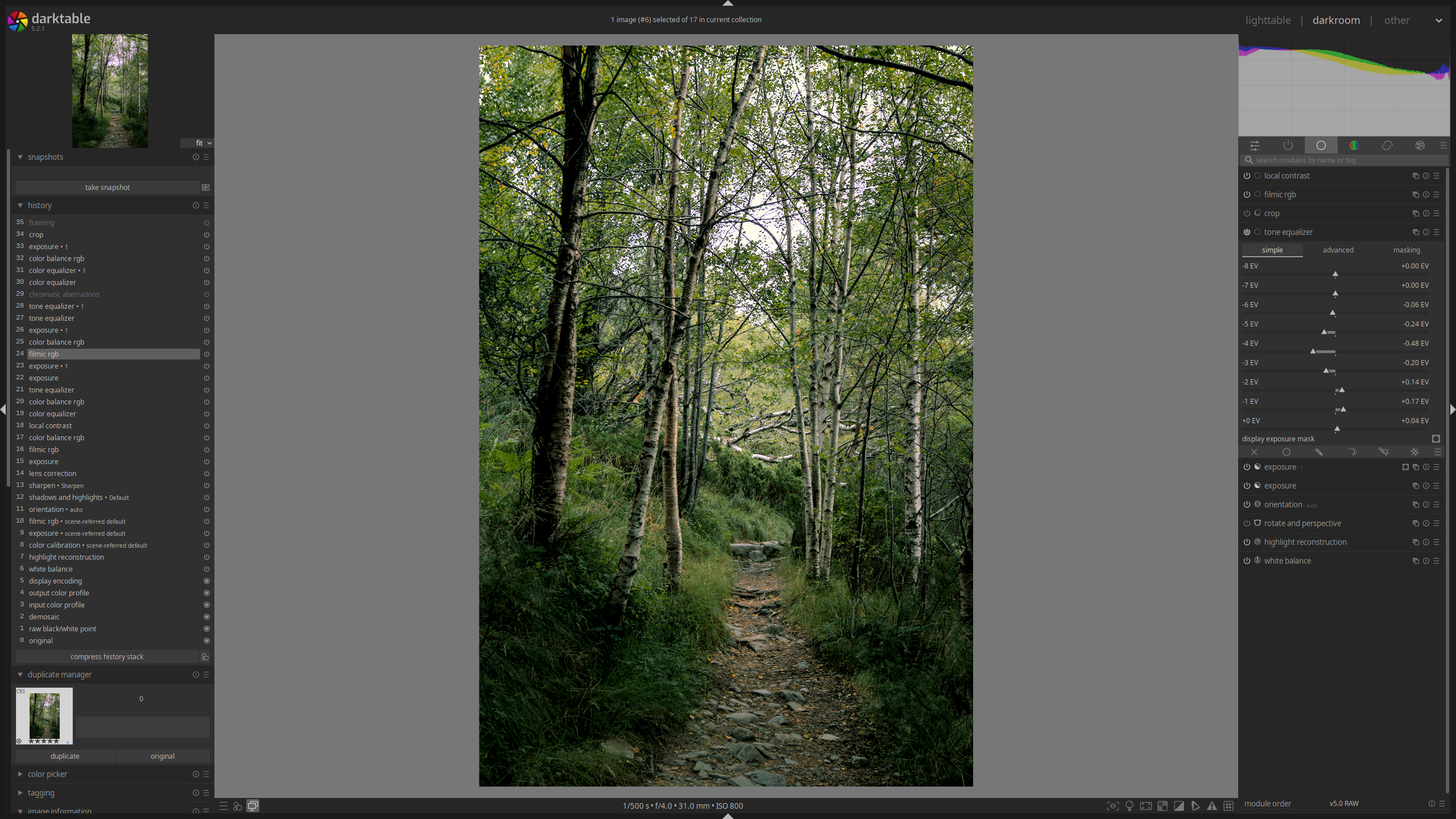
Image after applying advanced exposure adjustments
Final touches
The steps above may be repeated several times as I work towards the idea I have for the image I’m editing. Sometimes it’s simpler; sometimes it takes a lot more fine tuning. In any case, I sometimes use the “duplicate manager” feature on the left-hand panel in case I want to experiment with taking the image in a completely different direction and then seeing if I like the result compared to what I’m doing now. I talk about this below too, as well as going over the history stack. You can see my history stack to the left in the image below to see all the iterative editing.
Final image fine tuning for color, exposure and contrast
Once I’m happy with everything above, I might end up applying either a crop or perspective adjustment (most often leveling the horizon). I will do this more often with sports or wildlife photography, as it’s harder to get the perfect framing in the moment, but I will also do it in landscapes from time to time, especially to straighten lines as I always seem to be ever so slightly off. I’ll do all these adjustments with the crop and rotate and perspective modules. For the latter, I usually draw a line on what I want to straighten out, as the module gracefully allows this, and then adjust slightly if I feel it looks crooked. Sometimes it becomes tricky as something that’s geometrically level might not look level based on the surrounding features in the image and how they affect its balance. In any case, it’s basically nitpicking, to be honest.
I no longer apply watermarks, but this can be done with the watermark module in the “effects” module group. I do sometimes use the framing module under the same module group when I publish an image to Instagram so I can fit it to their bizarre image sizing restrictions. And that’s basically it for editing!
Bulk editing and multiple edits
This works the same way it used to five years ago, so I’m just repeating the same process here.
When editing a lot of very similar images, you can edit one image and transfer the resulting history stack, that is, the edits you made, to the rest of the image set. To do this, you go to the lighttable view, select the image you edited, and in the “history stack” module on the right-hand side panel, click on “copy…” and select which edits you’d like to carry over. Then, select the rest of the images and click on “paste all”. They will immediately have the edits applied.
In order to store the edits you made to an image so you can later apply them to images from various sets, you can create a style. To do this, in the darkroom view, go to the bottom of the “history” module and click on the icon in the bottom right corner. Here, you can add a name and description, and select which edits you want your style to have. To apply the style, you only need to go to the lighttable view and in the “styles” dropdown, double-click on the style you want to apply.
Finally, if you want to re-edit an image without discarding your previous edit, you can create a duplicate by going to the “duplicate manager” module on the left-hand side panel in the darkroom view and create one. You can copy the history stack of your previous edit or start anew. To compare edits, you can use the “snapshots” function at the top of said panel, which will allow you to drag a slider that will uncover one edit on one side and the other opposite to it. Duplicates do not copy over the image but solely the history stack and other metadata, meaning that the storage cost is negligible.
Exporting
Exporting images in Darktable is rather simple. A few basic metadata fields can be edited with the “metadata editor” module on the right-hand side panel. Preferrably, you’d want to do this in bulk during import or even in-camera. However, if you’d like to edit something in particular for an image, you can do so there.
In the lighttable view, at the bottom of the right-hand side panel is the export module. Here, you can specify the format, quality, size, destination folder, among other things for the exported image. I recommend looking into what the image will be used for and export accordingly. For example, I have a preset for Instagram that compresses the image to JPG and restricts the length to 1080 pixels as per Instagram’s recommendations. I usually export to sRGB unless I’m printing, and I have different quality profiles depending on what I’m using the image for. You can actually export to multiple presets, which is wonderful in case you’re exporting the same image set for different uses. From here, just select the images you want to export, hit “export” et voilà.
Final image: https://www.instagram.com/p/DPpZQHJDiOl